<?php
require_once("../lib/phpchartdir.php");
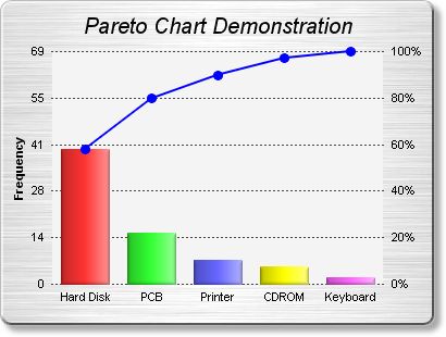
# The data for the chart
$data = array(40, 15, 7, 5, 2);
# The labels for the chart
$labels = array("Hard Disk", "PCB", "Printer", "CDROM", "Keyboard");
# In the pareto chart, the line data are just the accumulation of the raw data,
# scaled to a range of 0 - 100%
$lineData = new ArrayMath($data);
$lineData->acc();
$scaleFactor = $lineData->max() / 100;
if ($scaleFactor == 0) {
# Avoid division by zero error for zero data
$scaleFactor = 1;
}
$lineData->div2($scaleFactor);
# Create a XYChart object of size 480 x 300 pixels. Set background color to brushed
# silver, with a grey (bbbbbb) border and 2 pixel 3D raised effect. Use rounded
# corners. Enable soft drop shadow.
$c = new XYChart(400, 300, brushedSilverColor(), 0xbbbbbb, 2);
$c->setRoundedFrame();
$c->setDropShadow();
# Add a title to the chart using 15 points Arial Italic. Set top/bottom margins to 12
# pixels.
$title = $c->addTitle("Pareto Chart Demonstration", "ariali.ttf", 15);
$title->setMargin2(0, 0, 12, 12);
# Tentatively set the plotarea at (50, 40). Set the width to 100 pixels less than the
# chart width, and the height to 80 pixels less than the chart height. Use pale grey
# (f4f4f4) background, transparent border, and dark grey (444444) dotted grid lines.
$c->setPlotArea(50, 40, $c->getWidth() - 100, $c->getHeight() - 80, 0xf4f4f4, -1,
Transparent, $c->dashLineColor(0x444444, DotLine));
# Add a line layer for the pareto line
$lineLayer = $c->addLineLayer2();
# Add the pareto line using deep blue (0000ff) as the color, with circle symbols
$dataSetObj = $lineLayer->addDataSet($lineData->result(), 0x0000ff);
$dataSetObj->setDataSymbol(CircleShape, 9, 0x0000ff, 0x0000ff);
# Set the line width to 2 pixel
$lineLayer->setLineWidth(2);
# Bind the line layer to the secondary (right) y-axis.
$lineLayer->setUseYAxis2();
# Add a multi-color bar layer using the given data.
$barLayer = $c->addBarLayer3($data);
# Set soft lighting for the bars with light direction from the right
$barLayer->setBorderColor(Transparent, softLighting(Right));
# Set the labels on the x axis.
$c->xAxis->setLabels($labels);
# Set the secondary (right) y-axis scale as 0 - 100 with a tick every 20 units
$c->yAxis2->setLinearScale(0, 100, 20);
# Set the format of the secondary (right) y-axis label to include a percentage sign
$c->yAxis2->setLabelFormat("{value}%");
# Set the relationship between the two y-axes, which only differ by a scaling factor
$c->yAxis->syncAxis($c->yAxis2, $scaleFactor);
# Set the format of the primary y-axis label foramt to show no decimal point
$c->yAxis->setLabelFormat("{value|0}");
# Add a title to the primary y-axis
$c->yAxis->setTitle("Frequency");
# Set all axes to transparent
$c->xAxis->setColors(Transparent);
$c->yAxis->setColors(Transparent);
$c->yAxis2->setColors(Transparent);
# Adjust the plot area size, such that the bounding box (inclusive of axes) is 10
# pixels from the left edge, just below the title, 10 pixels from the right edge, and
# 20 pixels from the bottom edge.
$c->packPlotArea(10, $title->getHeight(), $c->getWidth() - 10, $c->getHeight() - 20);
# Output the chart
header("Content-type: image/jpeg");
print($c->makeChart2(JPG));
?> |